
Intuitive health app to check your skin on melanoma
The client
SkinVision
The product
Health app
Platform
Native app
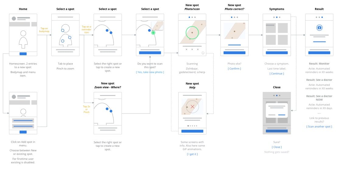
Creating an intuitive and positive app for users
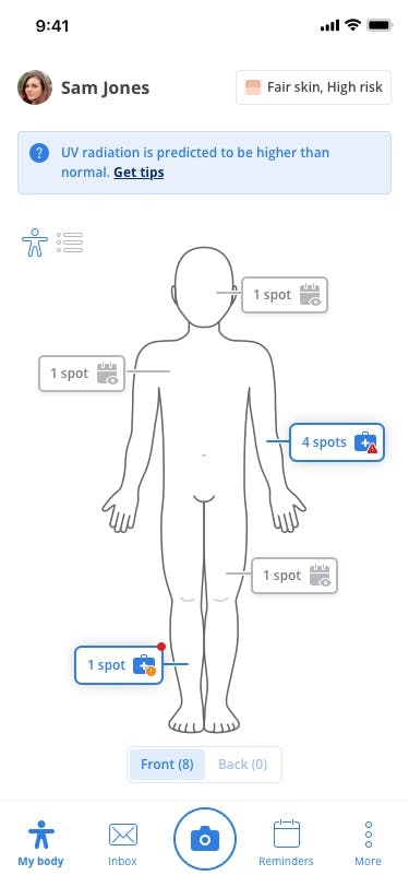
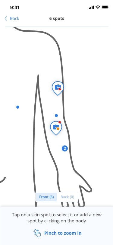
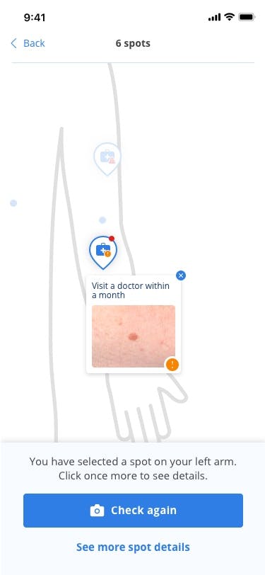
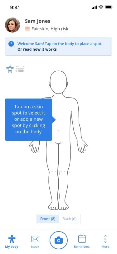
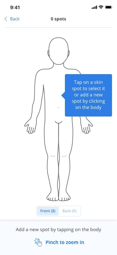
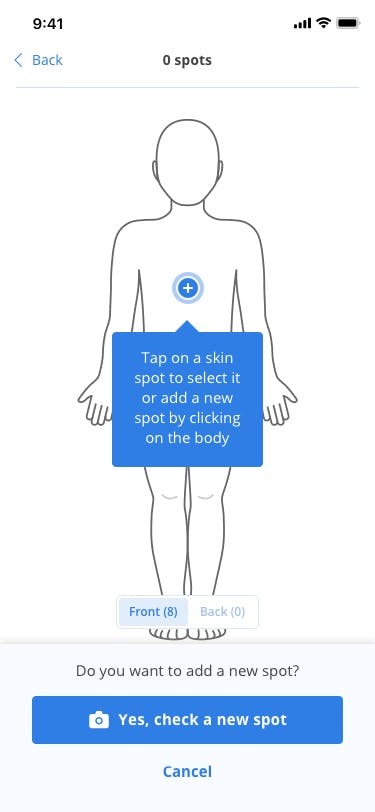
SkinVision aims to raise awareness of skin cancer and provides a regulated medical device to help individuals assess their risk and get to the doctor in time. We strived to provide users with an intuitive human experience. We copied the real-life experience of visiting the doctor into the app by allowing users to pin their skin spots on the digital version of their body. The app’s user interface should be intuitive for each type of user, as the user base of SkinVision is diverse.
The design we created is intuitive and deliberate. We took the knowledge gained from researching other medical apps, studying client guidelines, and reading user feedback on the existing app. We applied this knowledge to enhance the app’s functionality and by reducing usage errors to a minimum giving users a friction-free way of using the app.
Adding our experience to the SkinVision Team
We extended and strengthened the SkinVision design team by bringing specialized and profound visual design knowledge. We also provided extra support in creating delightfully convenient UX.
For SkinVision, we came up with a unique and consistent set of icons to use throughout the app. The icons play a significant role in the app. They are used for navigation and notifications, for providing feedback on scanned skin spots and for giving medical advice. Because of their functional importance, the icons had to be straightforward, realistic, and color blind friendly. We designed both solid and outline symbols, depending on their role. Each icon has a unique function and adds to the app’s identity.